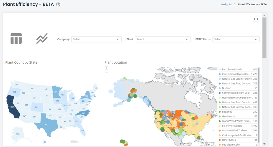
State Map
The map defaults to display all states and all plants by lat/long location. Clicking on a state in the map above will show you a state-specific view of all plants that operate in the state. You can filter these plants between plants owned by FERC-regulated utilities versus all utilities in the state via the “FERC Status” filter at the top of the screen.
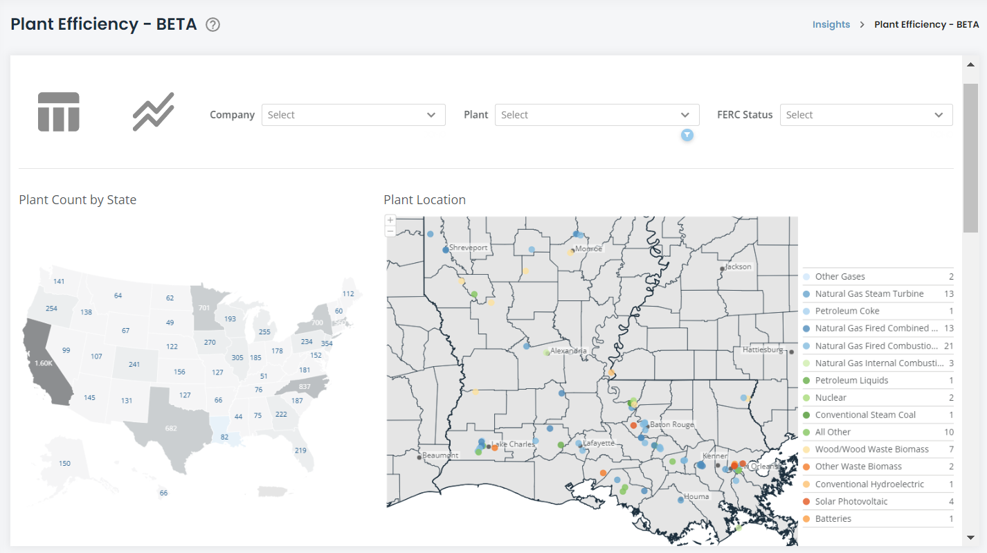
In this case, Alabama will be used as our example with FERC Status being “Regulated”.
Figure 1: Plant Efficiency - State Map
 https://www.hdata.ai/private-catalog
Figure 2: Plant Efficiency - State Map Drill-Down
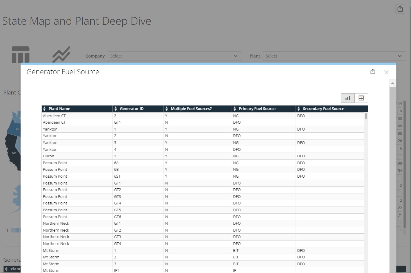
Plant Deep Dive
There are several different plants in the state of Alabama.
The plant key on the bottom of the map shows what type of plants are within the state, along with filters you can select to help focus on a particular plant name, or the utility.
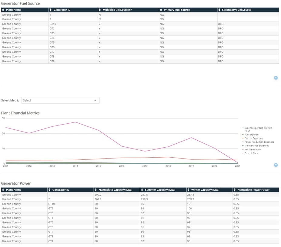
Clicking on one of the plant dots will lead you to the plant-specific deep dive. Let’s use the Greene County plant run by Alabama Power, just south of Tuscaloosa for our example.
In the screenshot below, you can see the Plant Deep Dive view in more detail. This view aggregates information on the plant sourced from both FERC and EIA data.
Figure 3: Plant Efficiency - Plant Deep Dive
Plant Deep-Dive Descriptions
- Plant Financial Metrics (source: FERC): Provides visualization for various financial metrics for the plant such as maintenance cost, net generation (in kilowatt hours), and fuel cost. Clicking on the "select metric" dropdown will allow you to view a particular metric from the visualization
- Special Note: the Plant Deep Dive works for all plants, but only a subset of plants are also FERC-regulated. In the case of plants that are not FERC-regulated, no data will populate in this widget.
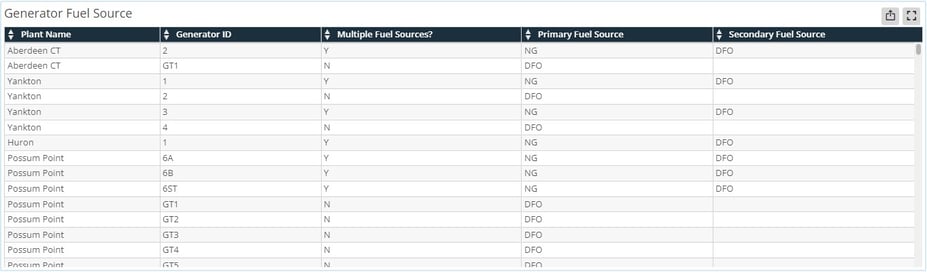
- Generator Fuel Source (source: EIA): Describes the fuel source(s) of each generator in the plant.
- Generator Power (source: EIA): Describes the power factors, nameplate capacities, and minimum load for each generator in the plant
Plant Comparison Tool
Now that you have an in-depth understanding of a single plant, a common question one may ask is: “how does this plant stack up against other plants?”
This is where the Plant Comparison Tool becomes important. You can access the plant comparison by clicking the table icon at the top left of the dataset.
Figure 4: Plant Comparison
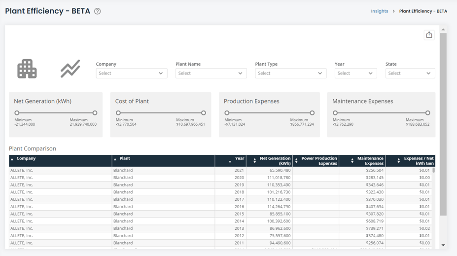
The Plant Comparison Tool lists every plant that is common between HData’s EIA dataset and FERC dataset.
Here, you can filter the table to focus on a particular state, plant type (nuclear, hydro, etc), company, or year. Or you can hone in on a particular plant. You can also filter the list based on several financial and operational metrics using the slider-filters at the top of the screen.
Clicking on the building icon at the top left of the dataset will bring you back to the plant deep dive and map screen. Clicking on the line chart icon on the top left will take you to the Plant Benchmarking Tool.
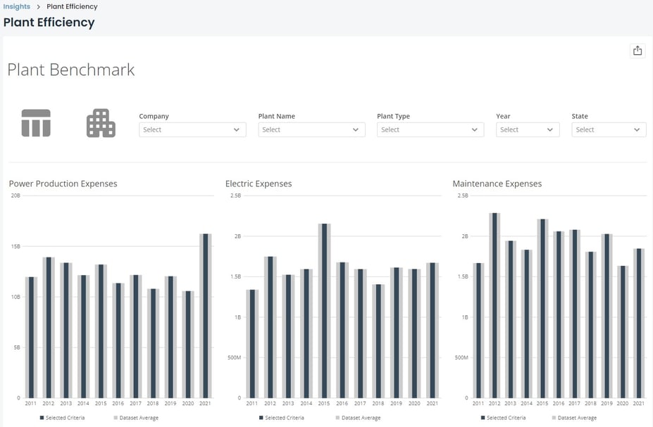
Plant Benchmarking Tool
The Plant Benchmark allows you to take a single plant, multiple plants, or a company and benchmark against the dataset average to determine how your selected group is performing relative to the entire country.
You can filter using the dropdown menus at the top of the screen. The benchmark will measure against an over-time series between 2011 and 2021. You can also filter to compare to a single year. Here are a couple of example scenarios:
Example 1: If you select a single company, like Georgia Power Company, all plants under Georgia Power will be in the navy-blue and averaged based on the metrics in the visualization. This will then be superimposed on top of the dataset average in the gray bars behind the navy bars.
Example 2: If you select a single plant, like the Vogtle Nuclear Plant from Georgia Power, it will benchmark in navy-blue the plant against the dataset average of nuclear plants in gray.
Figure 5: Plant Benchmark
Exporting Visualizations and Data
There are several ways in which the dataset can be exported. A visual export of the dataset via PDF or PowerPoint can be generated via the export button ![]() at the top-right corner of the dataset. Data can be exported via each card on the dataset. To export card data, move your cursor over the card/table and another export button
at the top-right corner of the dataset. Data can be exported via each card on the dataset. To export card data, move your cursor over the card/table and another export button ![]() will appear at the top right of the card/table. The data will export into a csv file in a long-table format.
will appear at the top right of the card/table. The data will export into a csv file in a long-table format.
An additional feature is the expand details icon on each card. Hovering your cursor over a card/table will show the export icon ![]() and the expand details icon
and the expand details icon ![]() . The expand details icon will give you a screen as seen below.
. The expand details icon will give you a screen as seen below.
Figure 6: Exporting Visualizations and Data
Once you click on the expand details icon, a screen will pop up giving you a few options to interact with that particular card. You can click on the export button at the top right of the popup to export the visualization either in a visual format or data table (CSV or Excel). Clicking the table icon
at the top right of the popup will show you the data feeding into the visualization.
Hopefully, this article gave you all the information you needed to be successful with the Plant Efficiency App. If you still need help, please reach out to us at support@hdata.us.