How to Use the Electric Price Analysis App
Description
The Electric Price Analysis App (EPAA) provides insight on how companies price electricity based on customer class across the country. Easily benchmark companies against state and regional averages, or against a custom peer group of companies across the United States.
- Industry: Electric
- Sub-Industry: NA
- Data Timeline: Monthly, annual
- Data Sources:
- EIA Form 861 - Annual Electric Power Industry Report
- Sales to Ultimate Customers
- EIA Form 861m - Monthly Electric Power Industry Report
- Sales and Revenue
- EIA Form 861 - Annual Electric Power Industry Report
- Geography: US States
Use-Case Overview
The Electric Price Analysis App (EPAA) combines data from the annualized and monthly 861 reports on the electric power industry from the Energy Information Administration (EIA). The application focuses on the average price of electricity on a per kilowatt-hour basis, taking revenue and volumes sold to customer classes and calculating an average price:
(Revenue / kwh) = price (the amounts are reported in thousands of dollars and megawatt hours which we've converted as the true dollar amount and kilowatt hours).
For more information on how this data is collected and presented by the EIA, please see their Guide to EIA Electric Power Data.
The EPAA is designed for easy comparison and benchmarking of price data between companies, states, and regions. Regions are defined by the National Association of Regulatory Utility Commissioners and the subsequent utility/service commission region members. In cases where one state may belong to two regions, HData picked a single region. Examples include Texas for MARC, Kentucky in MACRUC, and North Carolina in SEARUC.
Aspects of the application are also designed for easy exportability of both data and visualizations, either to combine with other data sources or to include in presentations.
Key Features
Profile Page
The Profile Page has two sides and five parts.
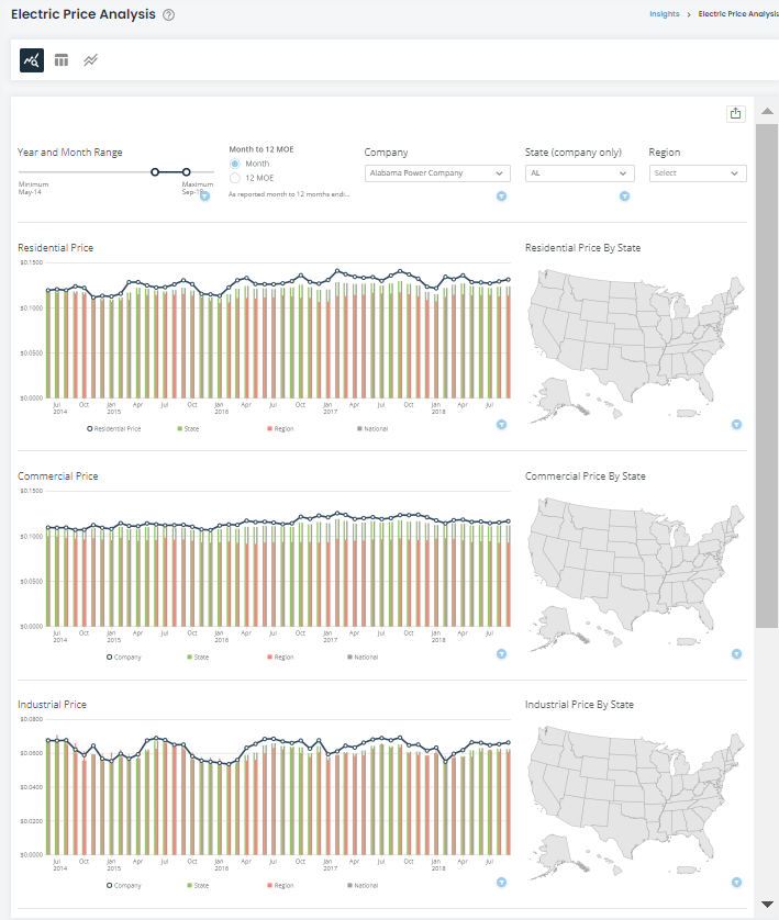
The parts consist of pricing based on customer class, along with a total retail price at the bottom of the screen. Each class is divided into two sides: a pricing chart over time, and a pricing map. Scrolling down the page will show each visual for the various customer classes.
Figure 1: Company Profile Page
Pricing Chart
The Pricing Chart has four dimensions in the view: the company price based on the company you select, the state average, the regional average, and the national average.
The state,region, and national averages do not need to be defined by you. Rather, selecting a company from the filter at the top of the screen will automatically load the state and region that company is a part of into the chart, and the national average will be constant throughout.
For example: selecting Southern California Edison Co (SCEC) will show SCEC's price in the navy-blue line, California's average in the green bar, the WSPSC average in the salmon bar, and the national average in gray. This will run down the page for each customer class.
In cases where a single company may operate in multiple states, such as Northern States - Minnesota, there is a state-specific filter that will impact only the pricing chart, allowing you to optimize the chart to your preference. Selecting no state will result in the state average being calculated across multiple states, and similarly for multiple regions.
The page defaults to displaying all thirty years of data we have. It is recommended that you narrow this date range to your preference to help improve performance and viewability of the data visualizations.
There are two ways to see the data in the map and charts via the variable selector in the filter area: Month or 12 MOE. Month is the as-reported month in the EIA data, while 12 MOE is 12 Months Ending which is a running sum of revenue and volume to calculate price.
For example, seeing data for December 2022 would mean that the price for that month is the sum of revenue between January and December 2022 divided by the sum of volume between January and December 2022. Looking at November 2022 would then be a calculation between December 2021 and November 2022, and so on. This is a running calculation that smooths data to show general trends in price that are less prone to external factors that could spike prices.
Price Map
The second side to the company profile is the Price Map. This is a comparative tool to show the average by state across the United States for the past year. You may also highlight regions in the map to show the average across the member states of regions. The maps are not impacted by any filter except for the region filter at the top of the screen.
The maps are visualized on a pre-set date range of the previous year.
For example, the most recent EIA filing as of this writing includes the months of January to December 2022. Once the updated data comes in for January 2023, the maps will reset to be the average for January 2023 only. Once February's data is released, then the map average will be the average of January and February 2023, and so on as new data is released, resetting the next year.
Price Analysis Table
The Electric Price Analysis Table is the en-masse data functionality of the application.
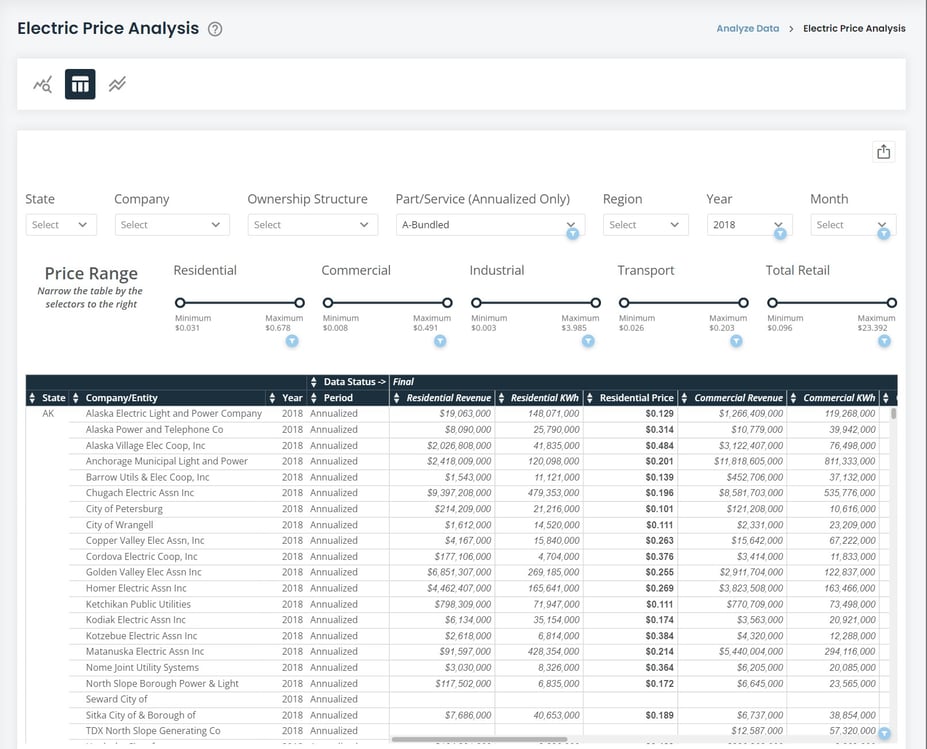
Here, you can use the filters at the top of the table to specify the range of data you need. You can conduct your analysis within the application itself or easily export it for outside analysis. The structure follows as a series of filters at the top of the screen with a resulting table below the filters.
The data for this table includes data from both the 861 annual and 861m monthly. How to see these is explained below.
All the data for this table is cleaned and verified by HData to fix naming discrepancies across time either due to ownership changes, rebranding, or other name changes and is reflective of the most recent name for the same EIA ID number. (For example: the buyout of SolarCity by Tesla. What was SolarCity in earlier filing years is now known as Tesla even if it filed under SolarCity in that year.)
Figure 2: Price Analysis Table
Pricing Data Filters
The Pricing Data Filters can be split into two categories: metadata and price ranges.
The first series at the top is the metadata. This includes the description of companies available to view and available periods of time. These filters also allow you to view either the annual, monthly, or both datasets within the table. This will be explained in more depth below.
One filter to call out specifically is the Part/Service filter. This only impacts data from the annual 861 as it is only reported in that filing and not the monthly filing. You can select the "annualized" data via the month filter at which point the part/service filter will populate.
The second series of filters are price ranges. This is based on the price data within the table. These sliders allow you to narrow the range of companies you want to look at in the table. These filters also impact each other, and it is best to think of them in "AND" statements.
For example: you can narrow the residential price range to between $0.105 and $0.205 and subsequently narrow the commercial range to between $0.155 and $0.255. This means you are looking for companies with residential prices between $0.105 - $0.205 AND commercial prices between $0.155 - $0.255.
Filterable Table
The Filterable Table is the result of the filters you select at the top of the screen. Clicking on the table does not impact the filters.
Think of this table as a viewable Excel table.
You can sort the columns via the up/down arrows next to each column. At the top of the table, you will see a "Data Status" with an arrow pointing to the term. There are two terms you may see in your analysis: final and preliminary. This is based on the EIA's publishing of the data and is typically based around the monthly data. The latest data published by the EIA is almost always in "preliminary" ![]() status, meaning that it is subject to change as new data is reported by companies or the EIA fixes data errors or makes predictions on non-reporting companies. Once it is fully vetted, it is noted as "final"
status, meaning that it is subject to change as new data is reported by companies or the EIA fixes data errors or makes predictions on non-reporting companies. Once it is fully vetted, it is noted as "final" ![]() meaning the data is not subject to change. The "final" status is also given by HData to the annual 861 data.
meaning the data is not subject to change. The "final" status is also given by HData to the annual 861 data.
The table defaults to showing the monthly 861m data for the current year. You can view annual 861 data by selecting a year (say 2021) and selecting “Annualized” in the Month filter.
You may select multiple months and keep annualized in the view if you wish. The table shows all customer classes as you scroll to the right of the table. Each price column is calculated from the revenue and volume in KWh from the preceding columns, so think of the revenue and KWh columns as both the reported values as well as the inputs to the price calculation of (revenue/KWh).
Company Peer Group: Peer Group Discovery
Peer Group Discovery is intended to compare utility data across either revenue or volumes sold.
It aids in the discovery of companies likely to be closest together in performance, enabling users to easily compare prices within the benchmarking portion of the page.
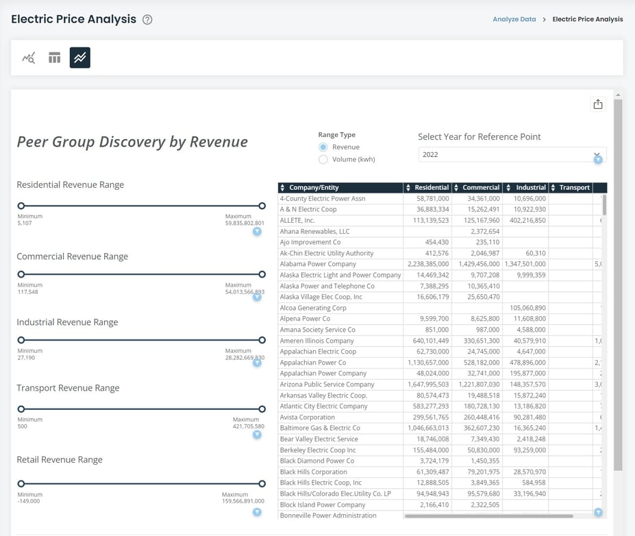
The discovery part of the page is split by several slider filters to the left and a table to the right, along with two filters at the top of the page. It is important to note that these filters do not impact the benchmarking portion of the page.
Figure 3: Peer Group Discovery
Top Filters
It is recommended to first adjust the filters at the top of the page.
The "Range Type" filter is a variable that will change the numbers in both the sliding filters and the table between a utility's revenue and volume sold.
The second filter at the top is a year selector. This is intended to act as a reference point for the table and sliding filters. The filter defaults to showing the latest year, but it may be more prudent to pick a historical year if you intended to show historical data. An example analysis may be showing rates in five year increments, simulating peer group adjustments over time.
Sliding Filters
The Sliding Filters allow you to adjust the list of companies you see in the table based on a range of your choosing.
These filters act very similarly to the Price Sliding Filters in the table page. i.e., they act as "AND" statements within the table of showing companies between range X AND range Y. These sliders will adjust between revenue and volume based on which range type you select at the top of the page.
Discovery Table
The Discovery Table acts as a static table, though each column can be sorted either alphabetically by the company or numerically by any of the customer classes across the columns.
All customer classes are shown, with retail as the last column in the table. The revenue and volume numbers are calculated as the sum of the monthly 861m data.
Benchmarking allows you to create a custom benchmark based on your own peer group and region. The intention of the page is to discover who your peer group might consist of via the Peer Group Discovery tool, but it can also be used if you have a peer group already in mind.
Benchmarking
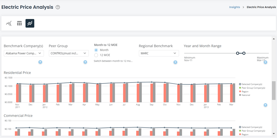
The filters in the middle of the page, below the "Benchmarking" title, control the series of charts below it.
The three drop-down filters control which companies and regions are displayed, while the date slider adjusts the range of year and months in the charts. Due to the size of the data and the number of time periods available, it is advised that you adjust the year and month range first before selecting companies and regions.
The first filter is the "Benchmark Company(s)." This filter controls which company is visualized in the dark navy line running across the chart.
You can select a single company, or multiple companies at which point their prices will be averaged. This is useful if you wish to compare larger corporations with multiple operating companies under them as one single entity.
The second filter, "Peer Group," operates the exact same way while controlling the lime-green bar in the chart.
IMPORTANT NOTE: the two filters default to showing "CONTROL (do not touch)." This is a mechanism in place to ensure that the benchmarking features operate correctly. You MUST have these selected in both company filters in order for the benchmark to function properly. If you happen to deselect it, you can search for it again like a company and include it in your selection.
The Month and 12 MOE is also available here. For more information, see the description under the Company Profile section of the documentation.
Lastly, the "Regional Benchmark" allows you to select any region to be displayed in the orange bar in the chart. This acts slightly differently than in previous pages of the application; instead of the region being automatically loaded into the chart based on the company you select, you must select which region you would like to view.
Many larger corporations own operating companies across multiple regions, so determining which region to select is now put on the user.
Figure 4: Price Benchmarking
Exporting Visualizations and Data
There are several ways in which the dataset can be exported. A visual export of the dataset via PDF or PowerPoint can be generated via the export button ![]() at the top-right corner of the dataset. Data can be exported via each card on the dataset. To export card data, move your cursor over the card/table and another export button
at the top-right corner of the dataset. Data can be exported via each card on the dataset. To export card data, move your cursor over the card/table and another export button ![]() will appear at the top right of the card/table. The data will export into a csv file in a long-table format.
will appear at the top right of the card/table. The data will export into a csv file in a long-table format.
An additional feature is the expand details icon on each card. Hovering your cursor over a card/table will show the expand details icon ![]() . The expand details icon will give you a screen as seen below.
. The expand details icon will give you a screen as seen below.
Figure 5: Regional Benchmarking
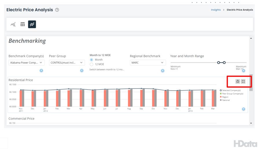 Figure 6: Export Prompts
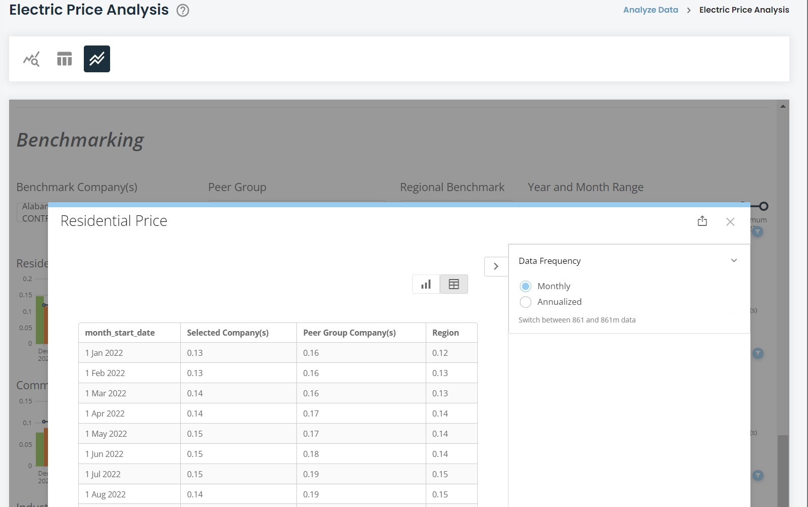
Once you click on the expand details icon, a screen will pop up giving you a few options to interact with that particular card. You can click on the export button ![]() at the top right of the popup to export the visualization either in a visual format or data table (CSV or Excel). Clicking the table icon
at the top right of the popup to export the visualization either in a visual format or data table (CSV or Excel). Clicking the table icon ![]() at the top right of the popup will show you the data feeding into the visualization.
at the top right of the popup will show you the data feeding into the visualization.
Hopefully, this article gave you all the information you needed to be successful wit The Electric Price Analysis Application (EPAA). If you still need help, please reach out to us at support@hdata.us.