Oil Cost of Service Analysis
This driver works best when a single company is selected and all metrics are represented back to the year 2011. To select a company, click on the company filter dropdown at the top left of the driver. All visualizations are displayed in an over-time series. You may change the range of data with the year slider at the top of the driver.
A ![]() icon indicates that a chart or KPI has a filter applied to it.
icon indicates that a chart or KPI has a filter applied to it.
Figure 1: Oil Cost of Service Analysis

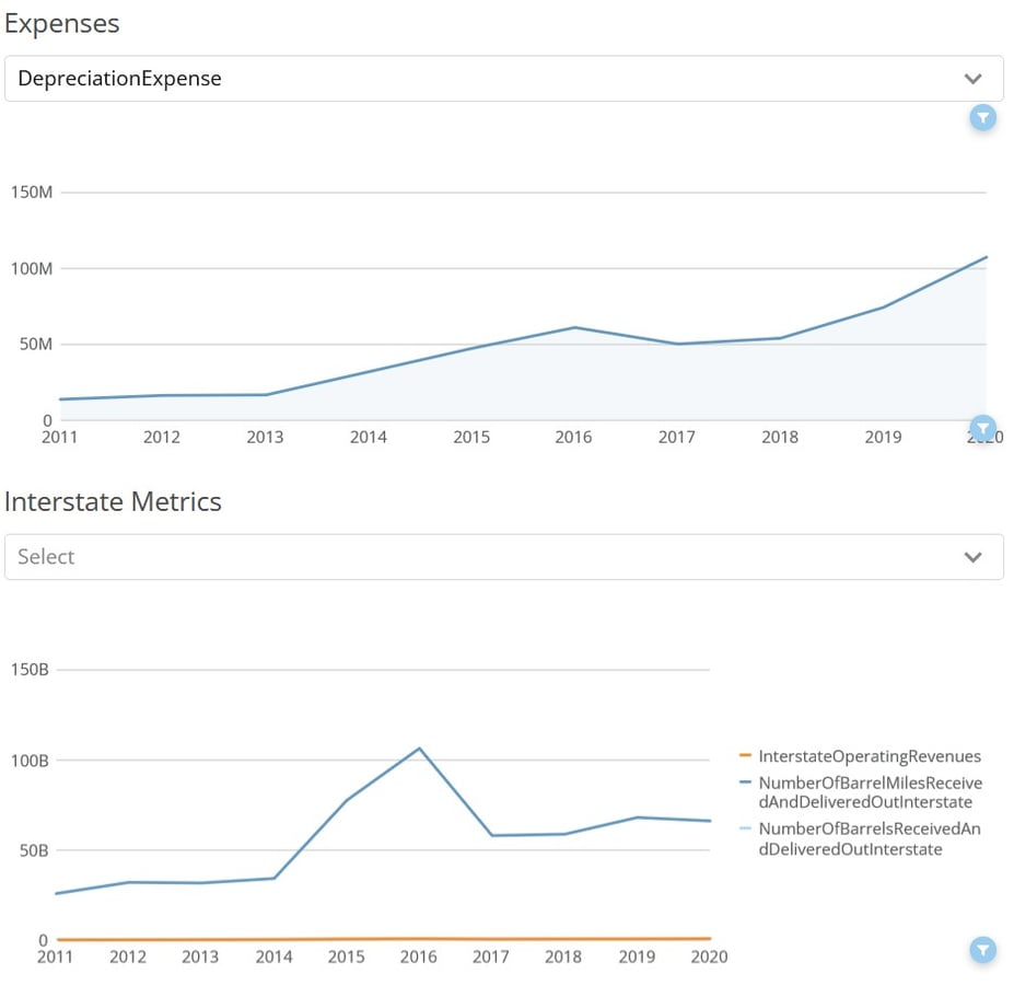
Expenses and Interstate Metrics
The “Expenses” and “Interstate Metrics” visualizations on the bottom of the driver each have their own drop-down menu with available metrics to select from.
Clicking on the dropdown menu and selecting a metric will filter the visualization below it to reflect just that metric. These dropdown menus do not filter the metrics in other visualizations.
Figure 2: Expenses and Interstate Metrics Visualizations
Exporting Visualizations and Data
There are several ways in which the dataset can be exported. A visual export of the dataset via PDF or PowerPoint can be generated via the export button ![]() at the top-right corner of the dataset. Data can be exported via each card on the dataset. To export card data, move your cursor over the card/table and another export button
at the top-right corner of the dataset. Data can be exported via each card on the dataset. To export card data, move your cursor over the card/table and another export button ![]() will appear at the top right of the card/table. The data will export into a csv file in a long-table format.
will appear at the top right of the card/table. The data will export into a csv file in a long-table format.
Exports will reflect the filters you select before the export.
An additional feature is the expand details icon on each card. Hovering your cursor over a card/table will show the export icon ![]() and the expand details icon
and the expand details icon ![]() . The expand details icon will give you a screen as seen below.
. The expand details icon will give you a screen as seen below.
Figure 3: Return on Rate Base Visualization
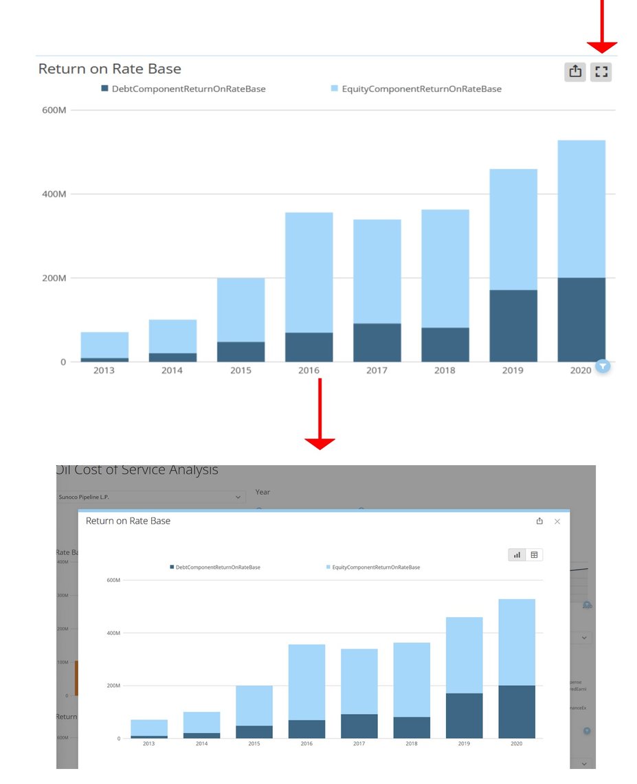
Once you click on the expand details icon, a screen will pop up giving you a few options to interact with that particular card. You can click on the export button at the top right of the popup to export the visualization either in a visual format or data table (CSV or Excel). Clicking the table icon
at the top right of the popup will show you the data feeding into the visualization.
Hopefully, this article gave you all the information you needed to be successful with the Operation Maintenance: Oil Cost of Service Analysis App. If you still need help, please reach out to us at support@hdata.us.