O&M Summary
The O&M Summary Page lists performance against several KPIs.
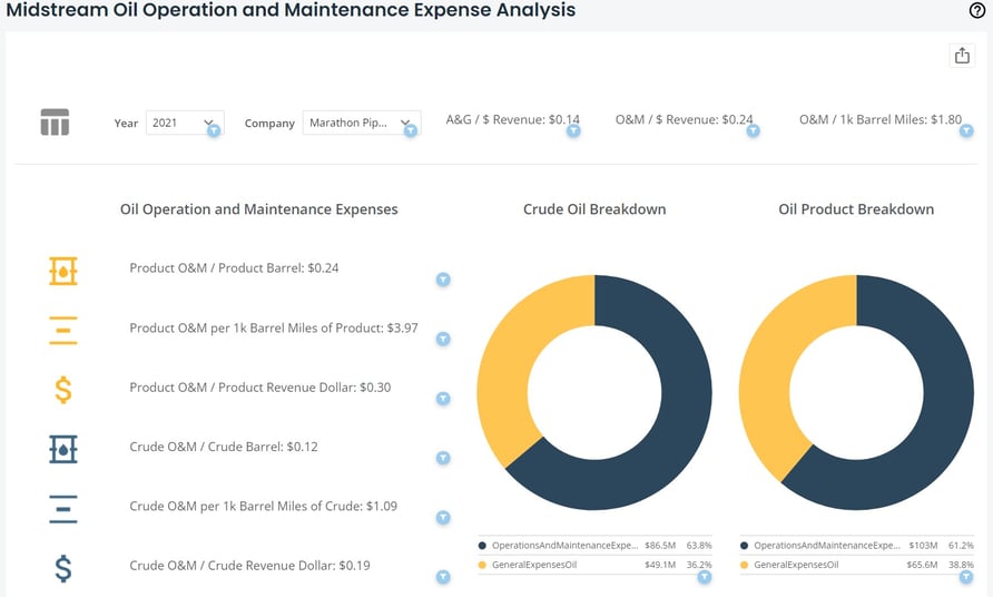
Data at the top of the chart appears on a generalized, company-wide basis. Data along the left-hand side appears for subcategories of crude and oil product. The two charts in the middle represent the various O&M costs as totaled from page 302 in the FERC Form 6.
Figure 1: Midstream Oil Operation and Maintenance Expense Analysis
A ![]() icon indicates that a chart or KPI has a filter applied to it.
icon indicates that a chart or KPI has a filter applied to it.
Filters are available on the top-left side of the chart. You can select between single years going back to 2011 for any FERC-regulated oil company. Some data may not appear, which indicates that the company did not file any information with the FERC on that KPI, or the filters you applied do not capture data for that data range. If no data is available, you will receive an indication of “no data in filtered range.”
To continue your analysis and do a deep dive into the O&M data, select the table icon ![]() on the top-left side of the dataset.
on the top-left side of the dataset.
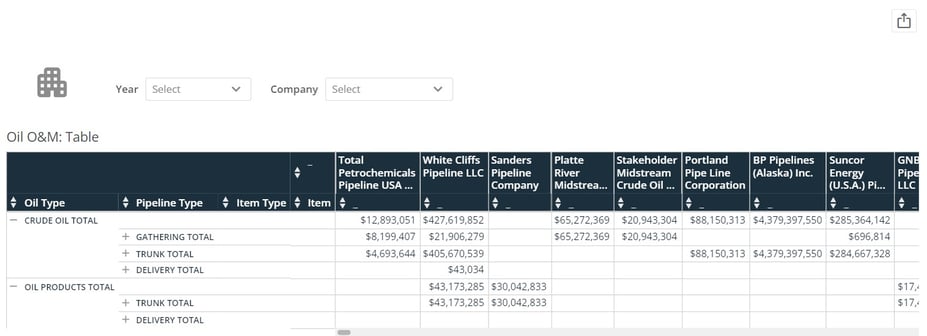
O&M Table
The O&M Table allows you to dive into every line item from page 302 in FERC Form 6.
What’s unique about HData’s approach is that line items are categorized so they can be rolled up or down into subtotals. The initial view below is how you will see the table the first time you interact with the dataset.
Figure 2: O&M Table
Blank cells or cells with “###” indicate that no data was filed for that company for that line item and subsequent subtotal. Numbers follow the standard financial formatting where negative numbers are presented as (12,345). The same filters in the O&M Summary are available in the O&M Table at the top of the dataset, but are changed to be multi-select. Each company you select will populate the table as seen below. Each year you select will be added as a summed number in each cell to represent total expenditure for the years you select.
Figure 3: O&M Table Drill-Down

To drill down to a particular line item, click on the “+” icon next to each subtotal.
The line items are labeled as unspaced text; this is the tag the FERC has created for each line item in the Form 6. To roll data back up, click the “-” icon next to the expanded subtotal. To go back to the summary page, click the building icon ![]() at the top-left of the dataset.
at the top-left of the dataset.
O&M Visualization
Selecting data in the O&M Table will drill down into a visualization that compares the datapoint you select on a year-over-year basis between the companies you selected in the table.
There are multiple ways in which to select data. You can: 1) select a row of data by line item or subtotal, or 2) select a cell of data to see data for that line item and company.
For example, clicking on the subtotal “OutsideServiceOperationAndMaintenance” in the “item” column in the table snapshot above highlights the entire row for the three companies. Doing this will automatically generate a line chart as seen below.
Figure 4: O&M Table Visualization
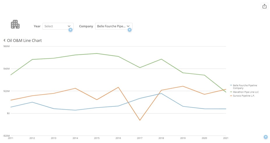
You may initially see dots where you would expect lines. Ensure that the “year” filter at the top of the dataset has multiple years selected.
To fix this, it is easiest to select “clear all” in the year filter, allowing the line chart to populate back to 2011. You can add companies to this view in the “company” filter at the top. To select a new line item or subtotal from the table, click the “O&M Table Viz” title at the top-left of the visualization. This will take you back to the table and you can repeat the process for any sub-total or line item.
Exporting Visualizations and Data
There are several ways in which the dataset can be exported. A visual export of the dataset via PDF or PowerPoint can be generated via the export button ![]() at the top-right corner of the dataset. Data can be exported via each card on the dataset. To export card data, move your cursor over the card/table and another export button
at the top-right corner of the dataset. Data can be exported via each card on the dataset. To export card data, move your cursor over the card/table and another export button ![]() will appear at the top right of the card/table. The data will export into a csv file in a long-table format.
will appear at the top right of the card/table. The data will export into a csv file in a long-table format.
Exports will reflect the filters you select before the export. For example, if you wish to export all data from 2020, clear the company filter at the top of the dataset and select “2020” in the year filter. This will allow you to export data from every FERC-regulated utility from 2020 via PDF, PowerPoint, or a csv. Any part of the dataset and any card can be exported in this fashion. ![]()
![]()
An additional feature is the expand details icon on each card. Hovering your cursor over a card/table will show the export icon ![]() and the expand details icon
and the expand details icon ![]() . The expand details icon will give you a screen as seen below.
. The expand details icon will give you a screen as seen below.
Figure 5: Exporting Visualizations and Data
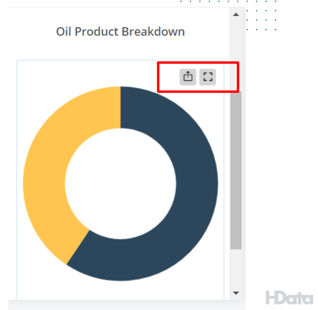
Figure 6: Oil Product O&M Breakdown
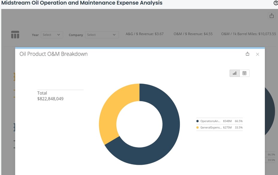
Once you click on the expand details icon, a screen will pop up giving you a few options to interact with that particular card. You can click on the export button ![]() at the top right of the popup to export the visualization either in a visual format or data table (CSV or Excel). Clicking the table icon
at the top right of the popup to export the visualization either in a visual format or data table (CSV or Excel). Clicking the table icon ![]() at the top right of the popup will show you the data feeding into the visualization.
at the top right of the popup will show you the data feeding into the visualization.
Hopefully, this article gave you all the information you needed to be successful with the Operation Maintenance: Oil Dataset. If you still need help, please reach out to us at support@hdata.us.