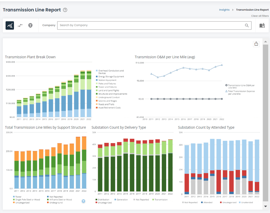
Transmission Line Dashboard
The included report starts with a high-level overview of key KPIs and metrics that span the total dataset of transmission lines and substations.
You may filter these metrics using the company filter at the top of the screen. The visualizations show all historical data from 2011 to present. The two icons at the top left of the screen will help you navigate to the Transmission Line Table and the Substation Table to view the particular assets.
Figure 1: Transmission Line Dashboard
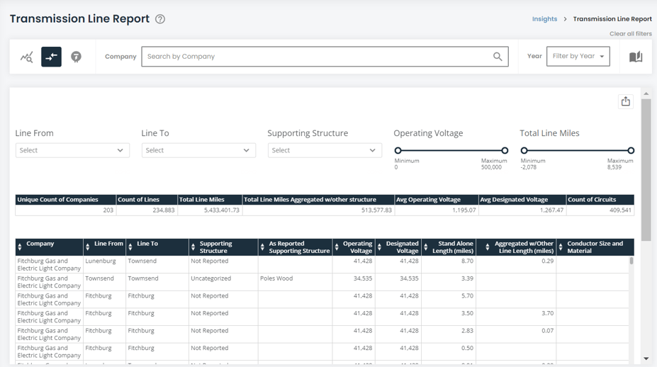
Transmission Line Table
The second part of the report focuses on the particular lines as reported by utilities.
The filters at the top of the screen impact both the summary table in the middle of the screen and the larger asset table at the bottom of the screen. The data feeding into this table was cleansed to remove discrepancies in the data and to ensure data was similarly categorized. As such, "Supporting Structure" represents the categories as mandated by the FERC and cleaned by HData, while "As Reported Supporting Structure" is the information as reported verbatim by the utility in their FERC Form 1.
The two icons at the top left of the screen will help you navigate to the Transmission Overview and the Substation Table to view the particular assets.
Figure 2: Transmission Line Report
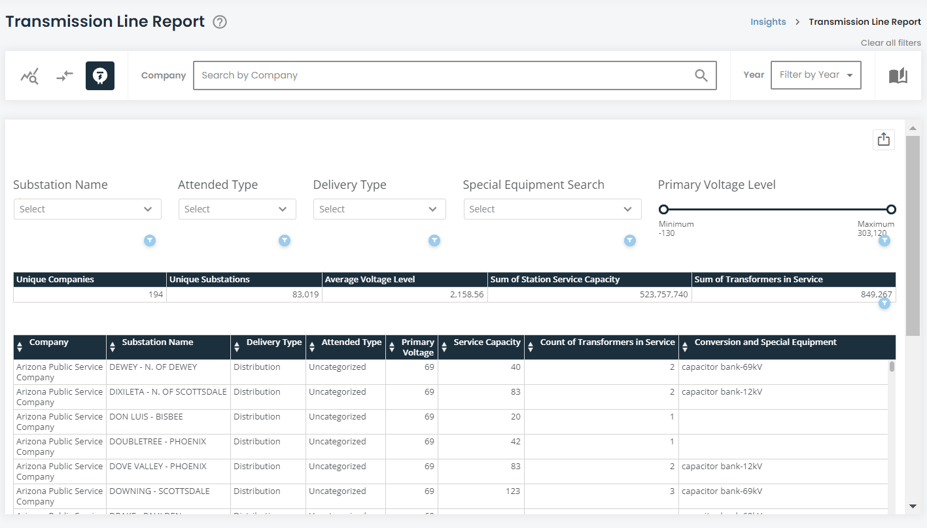
Substation Table
The last part of the report focuses on substations as reported by utilities.
The filters at the top of the screen impact both the summary table in the middle of the screen and the larger asset table at the bottom of the screen, exactly like the transmission table.
The data feeding into this table was cleansed to remove discrepancies in the data reported under "delivery type" and "attended type" so it matches the standard set by the FERC. The two icons at the top left of the screen will help you navigate to the Transmission Overview and the Transmission Table to view the particular assets.
Figure 3: Substation Report
Exporting Visualizations and Data
There are several ways in which the dashboard can be exported. A visual export of the dashboard via PDF or PowerPoint can be generated via the export button ![]() at the top-right corner of the app. Data can be exported via each card. To export card data, move your cursor over the card/table and another export button
at the top-right corner of the app. Data can be exported via each card. To export card data, move your cursor over the card/table and another export button ![]() will appear at the top right of the card/table. The data will export into a csv file in a long-table format.
will appear at the top right of the card/table. The data will export into a csv file in a long-table format.
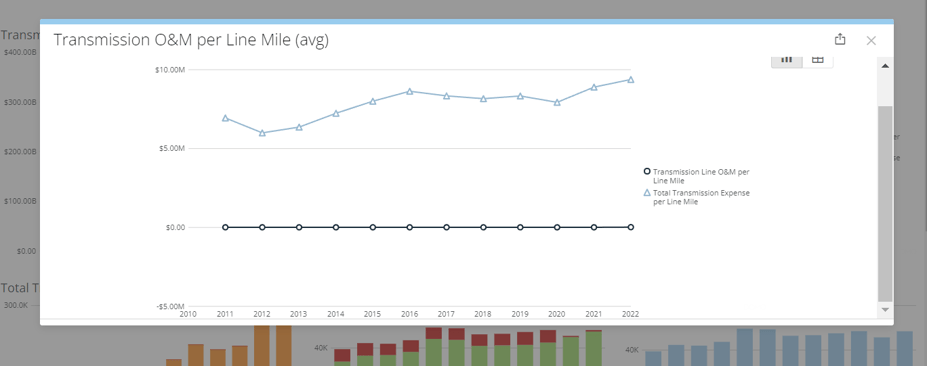
An additional feature is the expand details icon on each card. Hovering your cursor over a card/table will show the expand details icon ![]() . The expand details icon will give you a screen as seen below.
. The expand details icon will give you a screen as seen below.
Figure 4: Expand Details View
Once you click on the expand details icon, a screen will pop up giving you a few options to interact with that particular card. You can click on the export button ![]() at the top right of the popup to export the visualization either in a visual format or data table (CSV or Excel).
at the top right of the popup to export the visualization either in a visual format or data table (CSV or Excel).
Clicking the table icon ![]() at the top right of the popup will show you the data feeding into the visualization.
at the top right of the popup will show you the data feeding into the visualization.
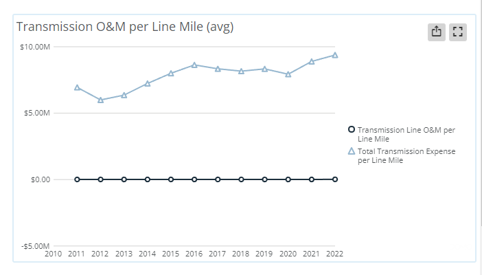
Figure 5: Transmission O&M per Line Mile