Utility Reliability Driver
Driver Description
The Utility Reliability Driver presents information on CAIDI, SAIDI, and SAIFI reliability metrics as reported by the Energy Information Administration between 2013 and as the EIA reports it. This includes both FERC-regulated and non-regulated utilities across the United States and can be narrowed by state, ownership structure, and year.
- Industry: Electric
- Sub-Industry: All
- Data Timeline: Annual
- Geography: US States
Data Sources
EIA Form 861
Definitions and Explainer
There are three main metrics that this driver visualizes, each are defined and contextualized below along with the other factors that may be included to calibrate the metrics.
- CAIDI: Customer Average Interruption Duration Index
- Definition: the total minutes of customer interruption divided by the total number of customers interrupted
- Context: describes the average time it takes to restore services
- SAIDI: System Average Interruption Duration Index
- Definition: calculated by multiplying the average duration of customer interruptions by their total number, then divided by the total number of customers in the system
- Context: describes the total duration of the average customer interruption
- SAIFI: System Average Interruption Frequency Index
- Definition: calculated by dividing the total number of customer interrupted by the total number of customers in the system
- Context: this metric is used to assess how often a customer experiences an interruption
There are also several additional metrics included in the analysis that calibrate CAIDI, SAIDI, and SAIFI based on customer needs. These are described below:
- With and Without MED: MED, aka Major Event Day, is an occasion when SAIDI, CAIDI, or SAIFI exceed a specific threshold and is indicative of particularly long outage depending on the metric it is included with. Excluding MED can normalize data to remove outliers, but it is important to understand that including MED or excluding it depends on the research question and the scope of the analysis to ensure it is being used properly and with integrity. If a number is the same when reported with or without MED, this means there were no major events for the year.
- Minus MED: minus MED only impacts the CAIDI metric and is used in a similar way as point number 1 above, but tied to CAIDI's particular method of calculation.
- Subtract LOS: LOS is loss of supply. Toggling the filter to subtract LOS means you are filtering out outage events where high-voltage transmission lines were unable to supply power. This metric is only available for utilities that report reliability metrics based on the IEEE standard (explained below).
There are two measurement standards that are reported to the EIA: IEEE and all other standards grouped into one. IEEE (Institute of Electrical and Electronic Engineers) maintains strict standards to measure CAIDI, SAIDI, and SAIFI that may differ from other regional or international standards. Most utilities follow this standard and it is the FERC's preferred standard. You will find a complete document on the methodology of the standard here. The "other" category as reported to the EIA also uses CAIDI, SAIDI, and SAIFI but may use slightly different thresholds to create those metrics. You can filter between these methodologies in a drop down filter in the driver at the top of the screen.
If you are still confused on what these metrics mean for you, it is recommended you go to the Energy Information Website where more documentation is available. You may also watch the video below created by the EIA that explains these reliability metrics.
Usage
The Utility Reliability Driver visualizes the data from the EIA to easily compare metrics on any utility across the country. The analysis is intended for electric analysts to assess performance on how reliably an electric utility can deliver and maintain electric services, and benchmark their performance against any other utility in the country.
Main Screen
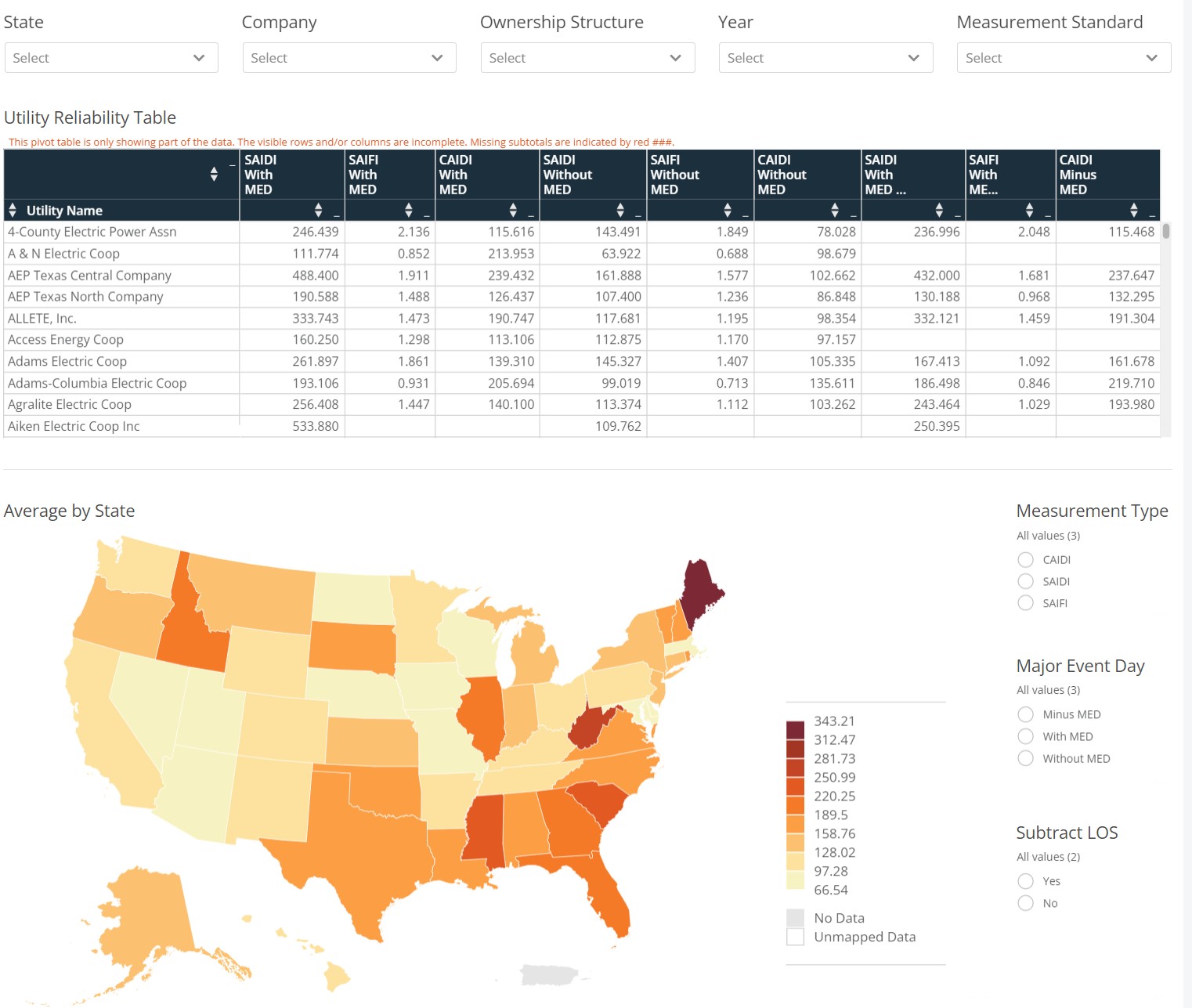
This driver is relegated to a single screen, allowing for easy access to all the reliability data in our database. The filters at the top of the screen will allow you to slice and dice the table as well as change what information is shown on the map at the bottom of the screen. For example, let’s filter this driver to focus on 2020, use the "year" drop down filter at the top of the screen.
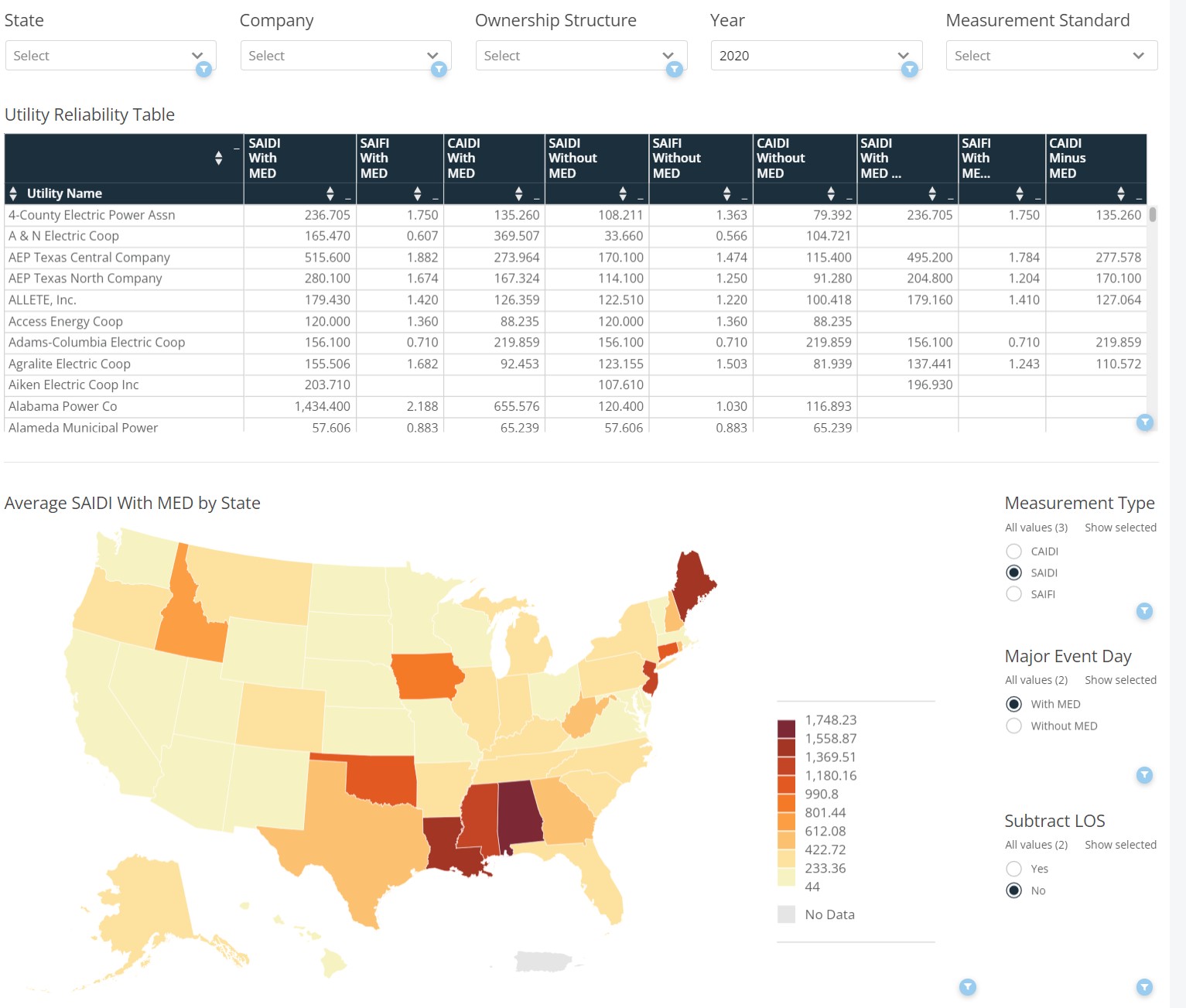
We now see all metrics for 2020 highlighted on the map and the table listing utilities. The map averages all companies in the state. You can select additional factors such as the "Measurement Type," "Major Event Day," and "Subtract LOS" to calibrate the reliability metrics on the map (these button filters DO NOT impact the table where the filters at the top of the screen impact all data in the driver). Let’s dive into a particular company and take a look at AEP Texas North. Click on that company name in the table to drill down into a visualization of their metrics over time. You may need to clear the year filter if you only see a few dots on the screen.
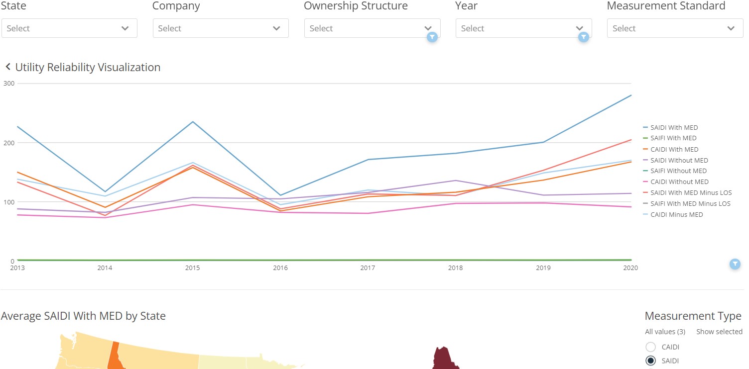
We can now see the metrics in a chart by reliability measurement. In order to select a new company, click on the back arrow next to the title of the chart, and it will take you back to the table view. As a general rule of thumb, it is advised to filter to a particular year first, then Ownership Structure or State in order to keep the driver functioning seamlessly. There is a lot of data feeding into the driver and casting too-wide of a search criteria can slow down the experience.
Exporting Visuals and Data
There are several ways in which the driver can be exported. A visual export of the driver via PDF or PowerPoint can be generated via the export button () at the top-right corner of the driver. Data can be exported via each card on the driver. To export data, move your cursor over the card/table and another export (
) button will appear at the top-right of the card/table. The data will export into a csv file in a long-table format. An additional feature is the expand details icon on each card. Hovering your cursor over a card/table will show the expand details icon (
). The expand details icon will give you a screen as seen below.
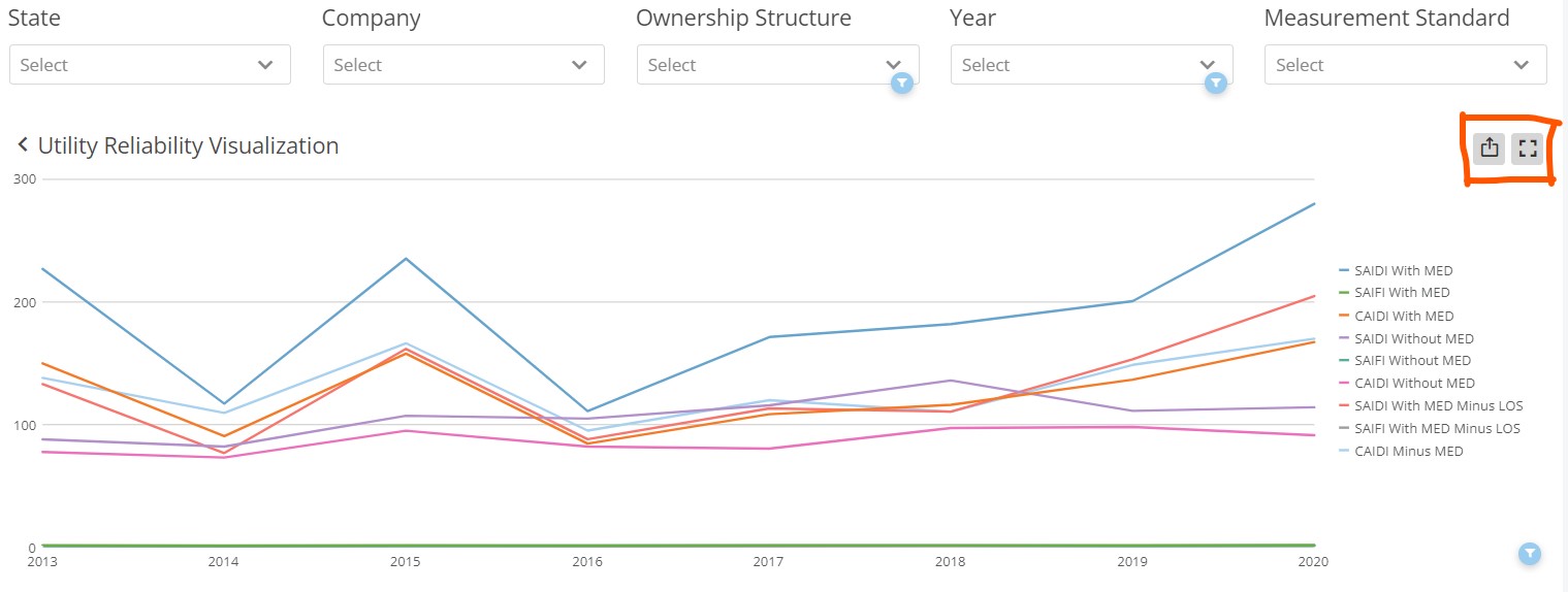
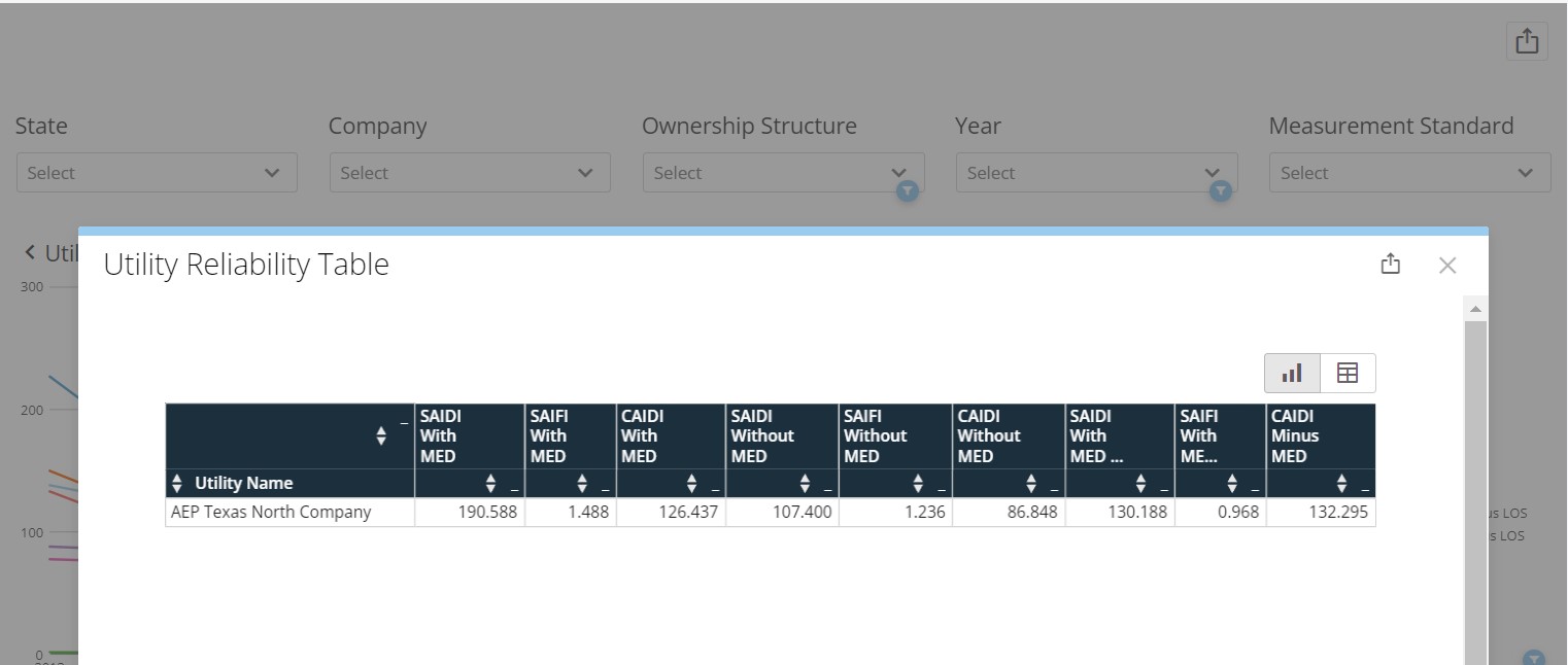
Once you click on the expand details icon, a screen will pop-up giving you a few options to interact with that particular card. You can click on the export button at the top-right of the pop-up to export the visualization either in a visual format or the data behind the visualization via CSV or Excel. Clicking the table icon
at the top-right of the pop-up will show you the data feeding into the visualization.